The legacy review UI turned every audit into a manual, high-friction process — scroll, hunt for evidence, rebuild context. Reviews took longer, approvals stalled, and consistent judgments became harder as frameworks scaled.
The legacy audit UI turned review into a manual, high-friction process. Instead of helping auditors quickly identify risk, validate evidence, and make consistent decisions, it increased review time, slowed approvals, reduced scalability across complex frameworks, and lowered confidence in the audit outcome.

The hardest part: translating a recursive, schema-heavy questionnaire into a clear, fast review workflow.
Shaped by stakeholder feedback, product constraints, and analysis of the questionnaire model — not a formal research program.
Instead of forcing one layout, I designed three complementary views over the same audit data: Sections for chapter-level review, Table for triage, Tree for structural inspection.
The hardest part wasn’t picking a layout — it was the mental shift. Stop asking “how do I show the questionnaire?” Start asking “how do I help a reviewer understand it?”
Once that flipped, Table became review-first, Tree became structure-first.
ISO 27001 nests four levels deep. Before settling the table treatment, I used AI tooling (Figma Make) to prototype four hierarchy approaches and compare side-by-side.
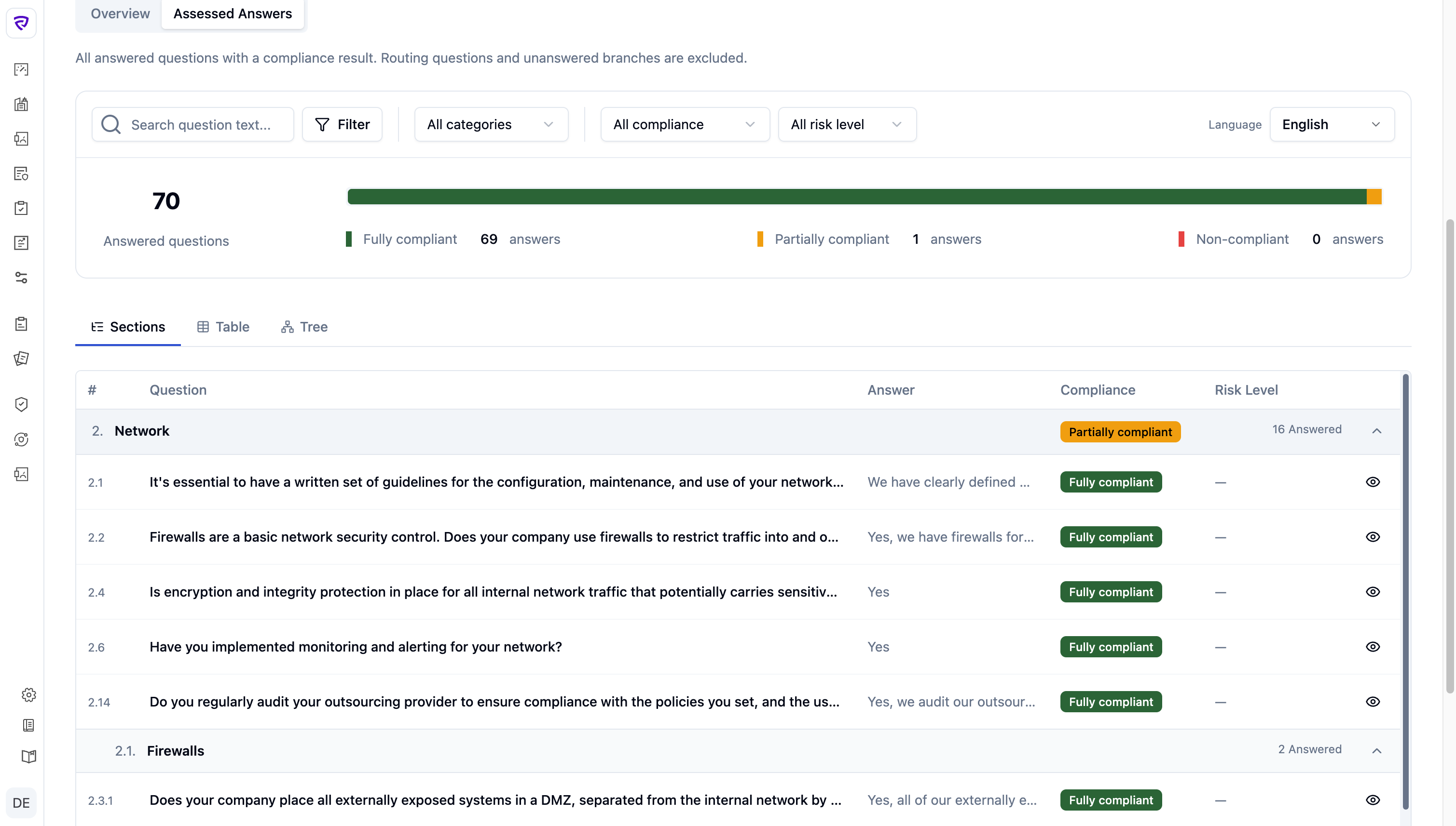
Each level gets a visual anchor without indentation eating the answer column. Hierarchy stays scannable, rows stay readable.
The audit experience is a journey: understand the state, locate the problems, take the next action. Splitting the work this way let each page (and each row) hold only what its job demanded.
The Audit Review Workspace ships as three view modes — Sections, Table, Tree — plus a slideout that opens from any view. Vibe-coded in the terminal — Vue 3 + Tailwind on shadcn-vue — and instrumented with Clarity and Hotjar.
“Assessed Answers,” not “Questions / Answers”
Renaming the tab from “Questions / Answers” to Assessed Answers narrowed scope to answered questions with a compliance result. The metrics, filters, and row design all flow from that constraint.
For reviewers who think in framework chapters. Compliance rolls up to the category, so the framework stays scannable before the auditor drills in.
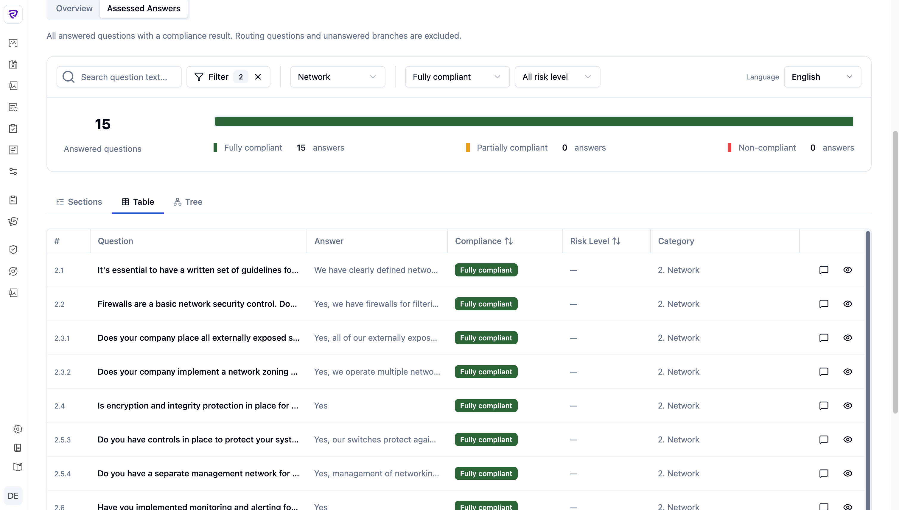
For triage. Same questions, flat — sortable by compliance and risk to surface what needs attention without fighting the structure.
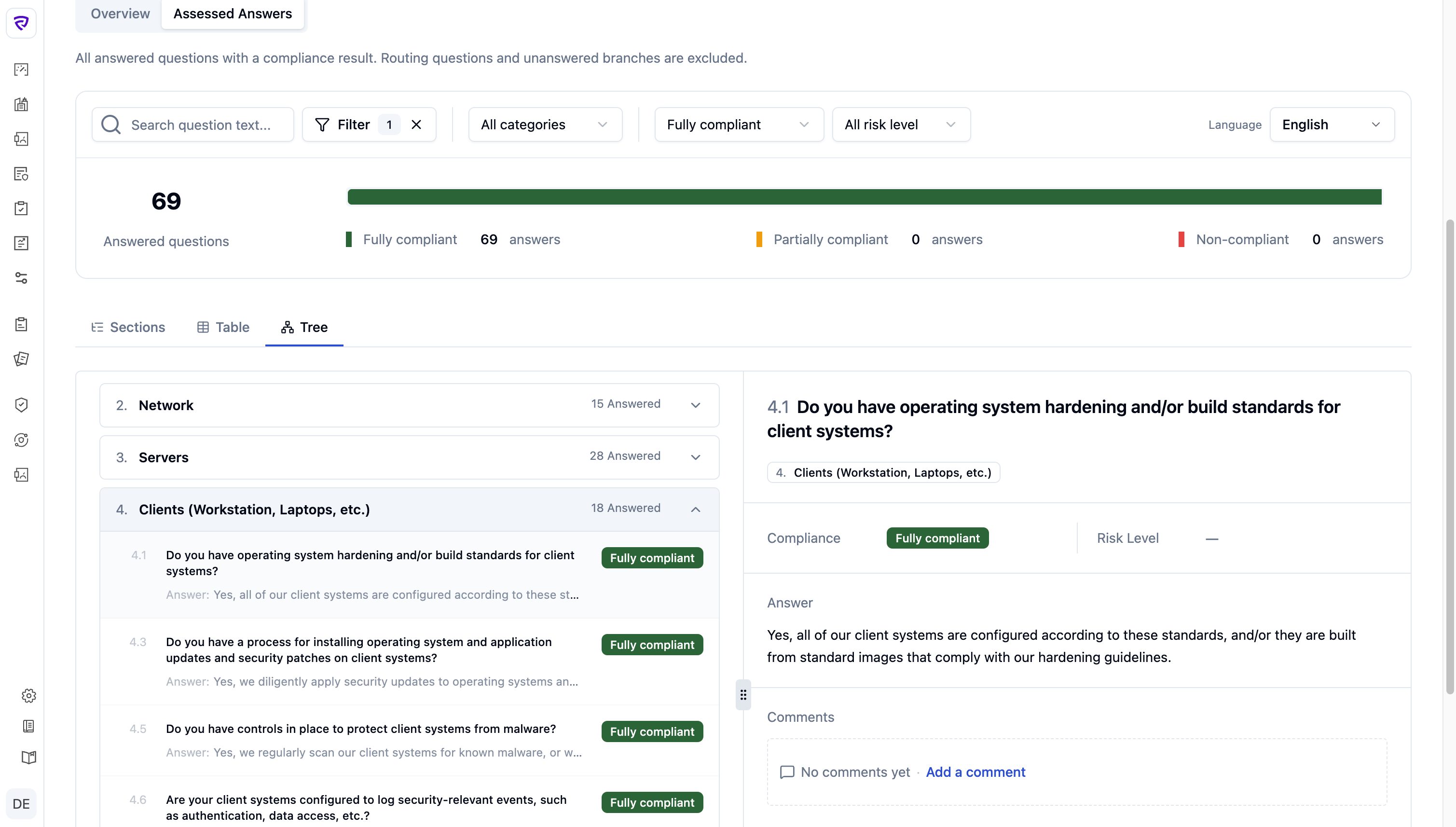
For deep frameworks (HIPAA, ISO 27001, NIS2). The tree shows the actual shape — sub-sections, controls, conditional branches — with status rolled up at every node.
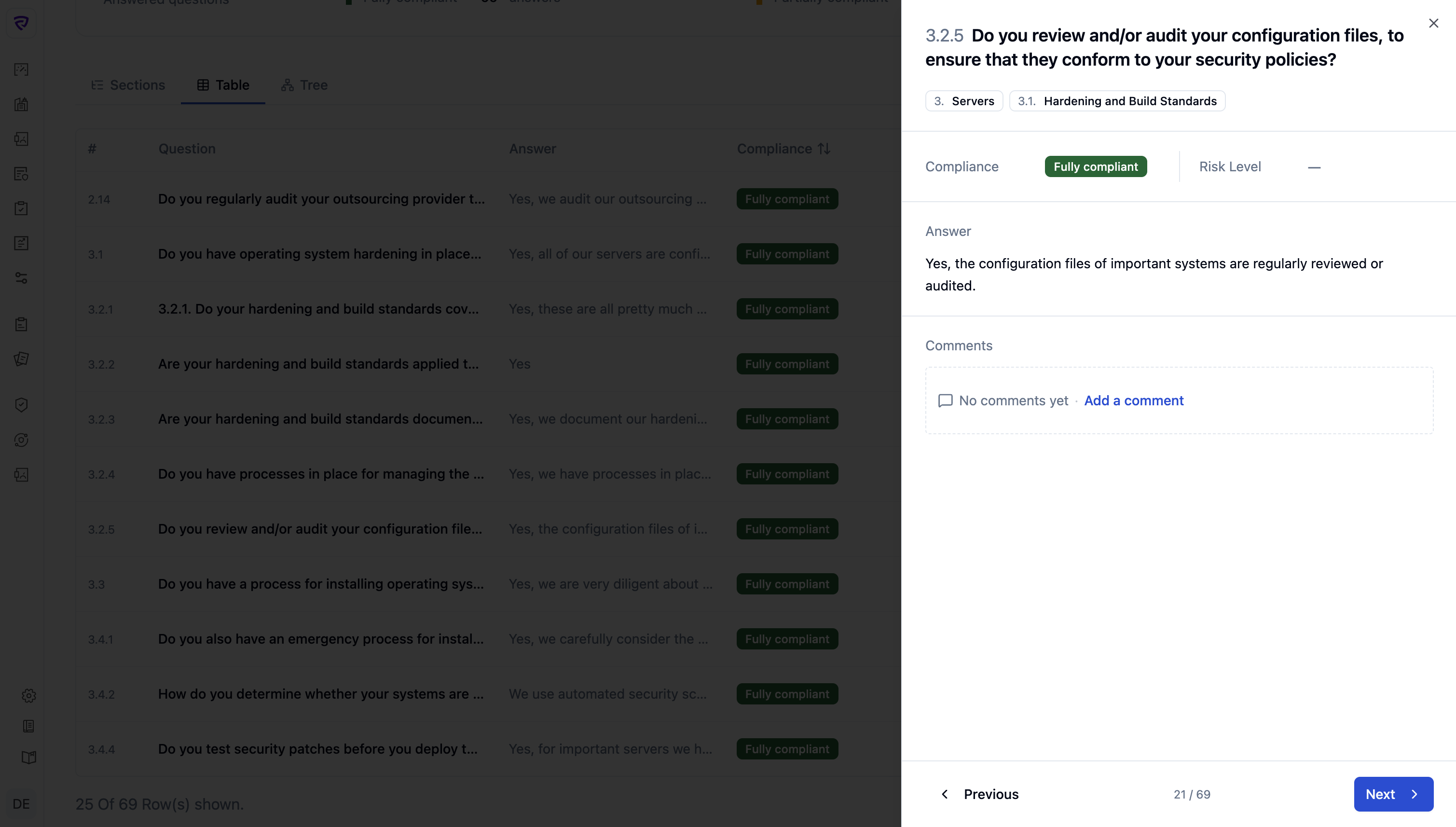
A judgment isn’t the answer alone — it’s the answer plus evidence plus prior comments. The slideout brings those together with a risk badge and opens identically from Sections, Table, or Tree.
I ran a usability session with a colleague who works inside the audit flow daily. The session surfaced friction I hadn’t anticipated; I iterated and shipped.
Solo design with eng support on the data layer — closer to a one-person feature team than a handoff pipeline.
Built the three views and the slideout directly in Vue + Tailwind + shadcn-vue, vibe-coding from the terminal. No Figma-to-eng handoff, no spec doc — production code was the source of truth from day one. Figma Make stayed as a thinking surface for the four-variant hierarchy exploration (above) before committing.
Sat with the person running real reviews daily. Friction I hadn’t anticipated surfaced in the session; iterated and shipped before the legacy UI was retired.
No dedicated backend pairing — eng pulled in when the data shape needed changes. The “Assessed Answers” naming decision (above) came out of one of those conversations with the founders.
The new audit experience replaced the legacy view in production in May 2026. Customer usage data is still accumulating, so this section reports what I can stand behind today: internal validation from the people running real reviews, the design decisions that proved themselves under scrutiny, and the metrics I’ve instrumented for the 30/60-day readout.
Clarity and Hotjar are running on the new views. The questions I’m answering with the first cohort:
When a product is built on a flexible technical schema, the best design move is often not to expose that flexibility directly — it’s to reinterpret it for the user’s task.
The task here wasn’t “fill in a questionnaire” or “manage a schema.” It was: understand outcomes, review answers, identify issues, act. Every decision — three views, slideout, “Assessed Answers” — flowed from that.