Transforming a static dashboard to a decision surface that connects compliance, audit, evidence, and cyber posture across the ResilientX AI Platform.
The dashboard had become a static report, not a decision surface. Users scanned briefly, then left to find meaning elsewhere.
The original dashboard — data-rich but decision-poor. Every metric had equal visual weight.
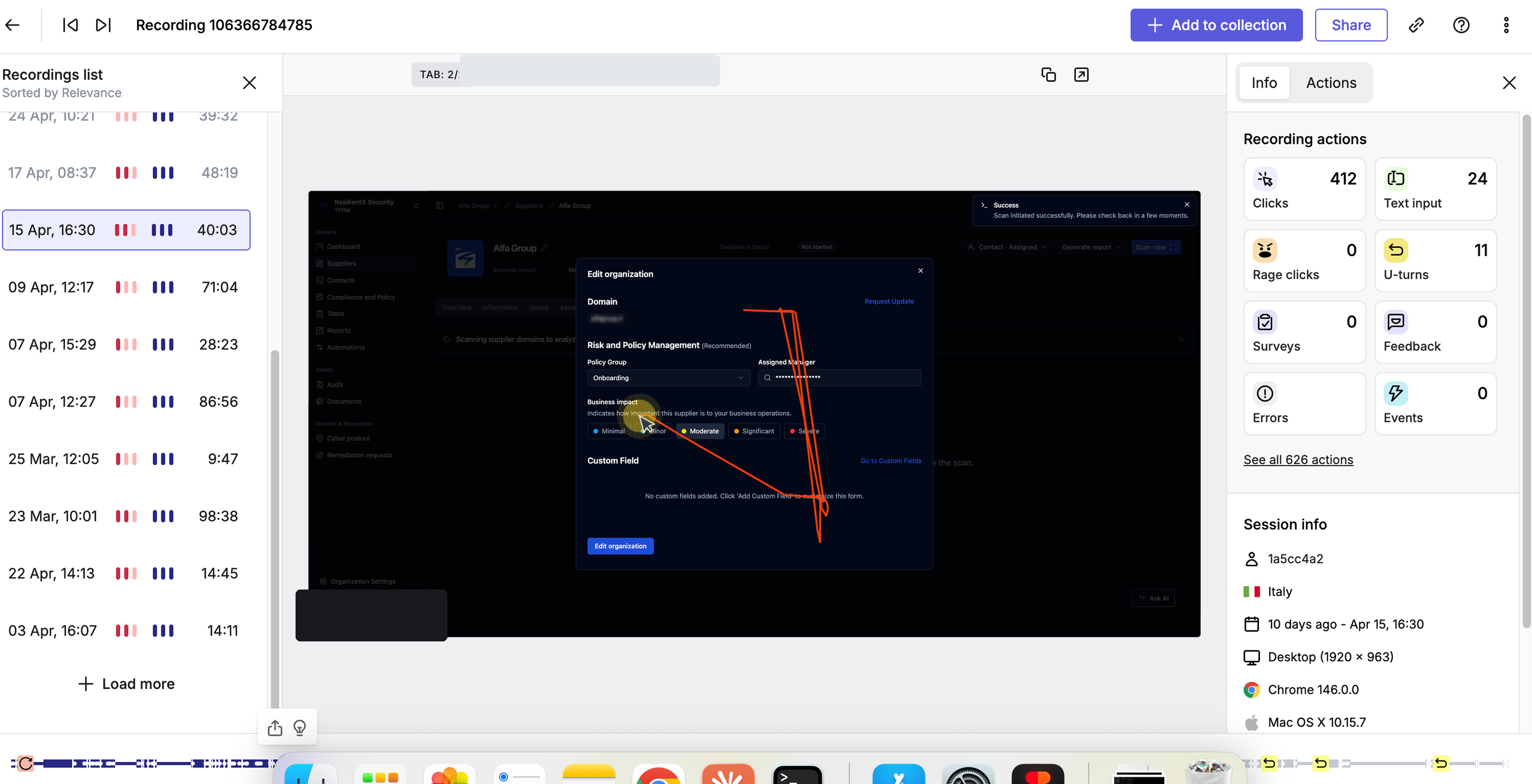
Hotjar · session recording of the legacy dashboard
Session recordings and heatmaps confirmed it: users scanned the top-level KPIs, then navigated to other modules to do their work.
Behavioral data showed the problem; the cause came from session analysis, click maps, stakeholder interviews, and competitor research.
The core challenge surfaced from CEO/CTO conversations and sales feedback: one dashboard had to serve three users, each with different questions and urgency.
To decide what goes where, three inputs: user urgency (time available), business value (what sales and leadership heard customers cared about), and competitor analysis of Panorays, OneTrust, SecurityScorecard, UpGuard.
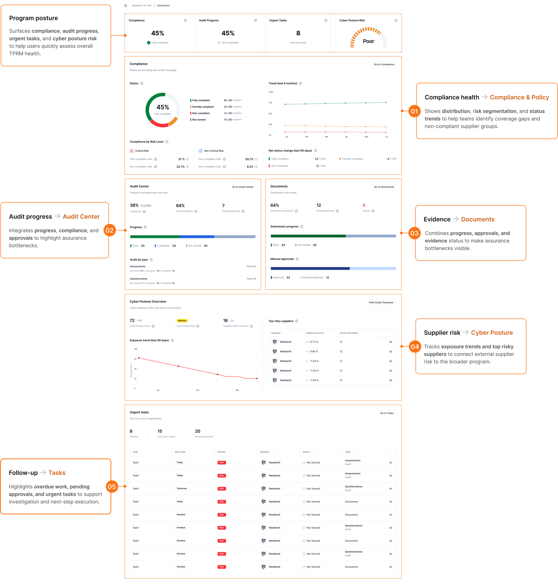
Hierarchy became reading order: orientation at top, compliance and audit health in the middle, cyber posture and tasks below — one layer per user.
Design Lead on the redesign. Solo design, with eng pairing on the front-end build and instrumentation feeding the design hypothesis from day one.
Partnered with the CEO and CTO on the strategic question — should the dashboard inform or route? Sales fed in what customers were actually asking for in calls.
Designed in production Vue + Tailwind + shadcn-vue — no Figma-to-eng handoff. Backend support pulled in for routing and data-shape changes.
Heatmaps, session recordings, and attention maps on the new surface from launch — so the design hypothesis could be falsified by data. The metrics in the next section come from this same instrumentation.
Same Microsoft Clarity instrumentation, same product surface — pre-launch baseline against the first 10 weeks post-launch. Users went from clicking around hunting (40% of clicks hit nothing, 1 in 3 sessions bounced right back) to a clean interaction surface where they know what is interactive and where it leads.
40% dead clicks, 32% quick backs. Users clicked around hunting, found themselves in the wrong place, came back.
2.7% dead clicks, 0% quick backs, 0% rage clicks. Users know what is interactive and where it routes.
Source: Microsoft Clarity, same workspace surface. Old dashboard: Dec 2024 – Feb 2026, 47 sessions · New dashboard: Mar 1 – May 14, 2026, 366 sessions. Sample sizes differ because the new dashboard launched into a higher-traffic period; figures are normalized percentages, so the before-and-after comparison holds.
Clarity’s attention heatmap shows the time-spent distribution across the new dashboard. Highest attention sits on compliance KPIs at the top, moderate on audit health and documents in the middle, lower on cyber posture below — matching the hierarchy decision made from user-urgency analysis.
Microsoft Clarity attention heatmap · New dashboard, Mar – May 2026 · Red = high attention · Blue = low attention
.png)